


By Steven Heller www.theatlantic.com
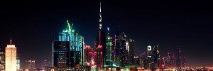
The tallest building in the world is, by definition, quite visible. So it makes some sense that the creators of the Burj Khalifa in Dubai were fastidious about the look of the tower—right down to the font faces in the parking garage. Austrialia’s Emerystudio, the firm designing the building’s wayfinding systems—the signage that directs visitors around the huge structure—wanted to employ Arabic typography that’d be distinctive, legible, and harmonious when placed next to Latin lettering. Now, the font created for the tower may be spreading to other parts of the fast-developing Middle East.

In 1978, Dr. Mamoun Sakkal, Syrian-born, U.S. type designer in Bothell, Wash., created a Latin-complementary typeface called Shilia (after a mountain range) for a Saudi company. At Emerystudio’s behest, he transformed it into a newer type family called Burj Khalifa Shilia. Was he inspired by the unparalleled views afforded by the skyscraper? Not quite.
“I wish I had a chance to go to the top of the building or wander in and around it,” Sakkal, who was commissioned in 2006, told me. “But when I started the design, the construction was at level 50 of a total of 160 floors, and during the few months it took to complete and approve the typeface design, 50 more floors were completed. Any inspiration was based on descriptions and imagined futures.”
For Sakkal, who was trained as an architect, making mental pictures of unbuilt structures was not a problem. Besides, when designing a font face like this, the main considerations are practical ones: “If you are driving your car through the building garage, you want to read the exit route signs easily and without confusion,” he said. “On the other hand, the typeface will be used throughout the project for many years to come, and it should maintain freshness, modernity, and timeless quality that would not date it or the building.” More info

